Monday, March 31, 2014

Designing a Beautiful IOS Apps


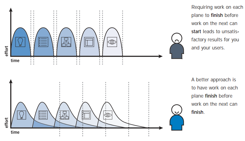
Task I: Consider Design Elements

Ia. What is it that you like about popular apps?  (Moving in a clockwise manner in Image 1 and then onto Image 2)

Image 1 - CW from center - dribble apps, White iPhone App, Standard iPhone App

Image 2

1) Warm Colors!  I like the way the dribble apps make me feel (all the warm colors are nice for someone like me who could live in India's sweltering heat year round and never get tired of it!  That probably isn't the case with everyone though, so I would probably have a quiz or 'calibration' to get started to match moods, colors and weather types!

Dribble App 1 
Dribble App 2


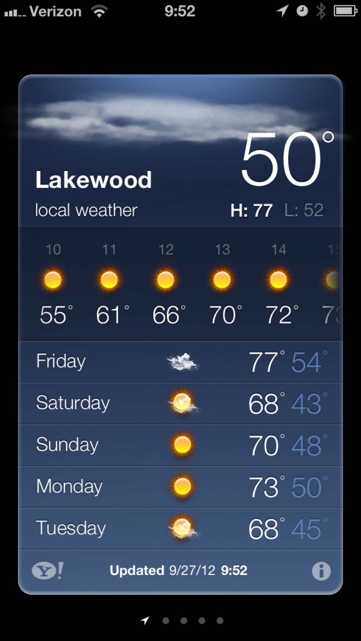
2) Forecasts I like that the general Apple App has a forecast so I can see the general trend for the day or week. This can be a mood killer or mood enhancer for the week. Even though the weather predictions are seldom correct, it's nice to have something to think about, I guess!

Standard iPhone App


3) I LOVE the weather app in the white iPhone below. The straightforward and sympathetic humor is like that friend that you love to hang out with but you aren't sure what your other friends will think of her! Real, down to earth and always going to make you smile!


4) In Image 2, I love the sample backgrounds that are telling of the weather. You hardly have to look at the numbers or anything else before you know what the weather is like!


5) Multi-Functionality Not shown, but I like the idea of having multiple cities saved so that if you live in the suburbs and work in the city, then you have have both sets of weather at your finger tips. Also, if they could gently fade back and fourth so that I don't have to scroll or fumble, that would be nice!  In this app below, you can adjust your home thermostat while also checking local weather. This is great for building managers and vacation goers!


6) Multi-sensory I love that popular apps are convenient and work in ways that work with us! I love the idea of having a weather app that would be set on a timer to let you know what the weather is as soon as you wake up so you don't have to click on anything - or it would pop up in your homescreen so that you can click and see or just look at the weather without having to open the app. Easy peasy pumpkin pie!

7) Design - I love that the intention of this app is to be a window into the day. Not only does it have clear depictions of what the weather will look like throughout the day, but it also helps me to feel like I am taking a peak outside! I love it!
 

8) Thinking Outside of the Box Having the bars makes it easy to tell the temp, humidity, rainfall, etc. throughout the day! I dislike that I don't know what the red line is supposed to indicate and the implication of turning a volume button up or down all the way, but I do enjoy the out of the box thinking that this designer brought forth! 


9) Simplicity These designs have a sense of simplicity to them and also use very clear lay outs and images so that you can get all of the information you need in one glance. It is easy to sweep across the app to the left to see the humidity, chances of rain and also what the weather looks like throughout the week. If I were to change this one, I would have an option to see a weather forecast by time for the day. Just a simple swipe to see something different would be great! In the Simple Weather App 2, there is a very simple and large depiction of the current weather and an easy to read temperature. The week forecast is easy to read and understand and there aren't too many distractions.  This app demonstrates what it needs to and gets away with having very little to show but still being very functional!  The Simple Weather App 3 tells the max and min temperatures and the city setting, making it simple and easy to use! 

Simple App 1
Simple App 2

Simple App 3
Simple App 4


Ib. What sticks out to you?
1) The warm colors 
2) I am not sure if the chunks of different color (both in squares and as horizontally stacked color sets) indicate different temperatures, weather types or something else.
3) It's easy to tell what is happening in the white iPhone app The blue raining indicates that it is in fact raining, no other information required.
4) In the iPhone App love the simplicity of the blue and the way the weather changes at the top.  I am not sure at first glance if the horizontal weathers indicate something different than the vertical indications.  The 73 is easy to read and I can tell what the weather is like just by looking. This one makes me want to fall asleep, however. 
5) Image 2- it's almost as if my weather app has become a window to the world outside. Such a smart phone to know what it's like outside before I get there. Can I see the same weather with the NY skyline? Chicago or SF skylines?

Ic. What would you design differently? 
1) Have something a little more automated
2) Have something for the visually impaired
3) Have warm and cold color settings so that people can adjust to their mood needs.


Saturday, March 29, 2014

Five Planes of User Experience

When developing any program (whether it is a class or a computer program) it is necessary to incorporate Five Plans of User Experience. Jesse James Garret in The Elements of User Experience Design has done a really great job of breaking down the frames of thought to help iterate through the User Experience and how to implement Designer (and company) goals, and how that plays out to the user.  For example, if you develop a really awesome on-line education course but no one is taking it -- you might want to know why and knowing the frame work where user experience breaks down would be useful in helping to develop the design. What are these five elements? They are: the Surface Plane (what is seen, how senses come into play in the user experience), the Skeleton Plane (what is the support and framework for which the sensory information is conveyed, what buttons are there to push, etc.), the Structure Plane (how does that skeleton fit into the rest of the world, how are things organized and placed/arranged), the Scope Plane (what are the goals, what are the necessary elements to make sure the goals are accomplished, what is needed for the user to be able to fully interact in the sensory plane and to be fully supported otherwise) and the Strategy Plane (how is information conveyed, how are customers finding out about information, what is offered for free, what is paid for, where are things placed, who is the target market, etc). All together these can help the designer create a foundation for user experience in any industry!  Today, we will talk about creating a functional website user experience....


The Strategy Plane -  Location: In designing each element
- Includes: What purpose designers are working towards, how users interpret what is conveyed
- Purpose: Matching user with need or purpose to developing company
- Languages: Various
- Example: Some strategic objectives are obvious: users want to buy products, and we want to sell them. Or role that advertising content produced by users plays in business model which might not be so obvious

The Scope Plane  - Location: Many places on the site
- Includes: What to save, data collected, features available, etc.
- Purpose: What how various features and functions constitute and how they fit together.
- Language: MySQL, PHP, Java, etc.
- Example: Commerce sites offer a feature that enables user to save previously used shipping addresses so they can be used again. Whether that feature or any feature is included on a site is a question of scope
The Structure Plane  - Location: Arrangement of navigational elements ex if allowing users to browse categories of products was the skeleton - the structure would be the categories of browsing
- Includes: Placement of interface elements, how site is navigable.
- Purpose: To organize materials, categorize things and make them easier to find, and utilize
- Language: MySQL
The Skeleton Plane  - Location: Beneath the Surface Plane.
- Includes: Placement of buttons, controls, photos and blocks of text.
- Purpose: Maximize effect and efficiency (you can't purchase something if you can't find the shopping cart button!)
- Language: Java
The Surface Plane - Location: the face of a web page
- Purpose: Performs some sort of function
- Includes: Images and text; logos, price information, pictures of items, etc.
- Languages: HTML, CSS


It's also important to develop these processes simultaneously so that you can see how all the elements fit together!


From: The Elements of User Experience Design, 2nd ed.  by Jesse James Garrett

Tuesday, March 25, 2014

Oscillate


I've always been fascinated with how to use one sense to create a representation within another sense. This video, Oscillate, seems to capture (at the very least) the pulses and intonations of sound, rhythm, compilation and intensity based on the movement and lay out of the sin waves. It's interesting to think how much can be conveyed through many pathways (taste through smell, and sometimes sound through feel)... This video is just too beautiful not to share!

Daniel Sierra created the video for his MFA Computer Art Program in the School of Visual Arts in NYC. He says, "My goal with 'Oscillate' was to visualize waveform patterns that evolve from the fundamental sine wave to more complex patterns, creating a mesmerizing audio-visual experience in which sight and sound work in unison to capture the viewer's attention." .


Fun with Cardboard Tubes!

From time to time, I save things like cardboard tubes which probably drives my roommates batty... but I've just found a great use for them!

Thanks HuffPost On Tumblr!


In Orbit


The world needs more art to experience and not just to find beautiful! 

Tomás Saraceno - in orbit


Tomás Saraceno - in orbit, art collection Nordrhein-Westfalen, K21 Staendehaus, © Tomás Saraceno
Photo: © Studio Saraceno
© Art Collection NRW


Creating Design

This Georgia O'Keeffe quote reminds me of what it feels like to try to create something or understand it... be it love, a piece of art or a design!  It's so incredibly powerful to yield to our limits and see what we can create with them anyways... 

 I know I cannot paint a flower. I can not paint the sun on the desert on a bright summer morning but maybe in terms of paint color I can convey to you my experience of the flower or the experience that makes the flower of significance to me at that particular time.” —Georgia O'Keeffe


Coffee Cup Inspirations #1

I am sure a cup of coffee will create more than one inspiration at some point in time... but I particularly liked this one to start. My preferences tend towards the helping people, seeing the world safer and more efficient and when I happened upon this one, it thought it was worth pointing out the inspiration caused by a cup of coffee (which in this instance can be stacked and have an easy to click lid attached!). It's amazing what seeing something for it's potential and not it's use will create!

Design Features


Check out their website and their IndieGoGo Campaign


  1. Lightweight
  2. Versatile (can turn into an office or other small house)
  3. Stack-able
  4. Quick Set-Up (quicker than any other emergency housing shelter)  

YouTube

So, as a physicist with a geeky EEing boyfriend... we often watch YouTube science videos to learn how to do fun experiments and new perspectives on the world around us.  This morning, I was watching a Sick Science Playlist and became frustrated with a few things that YouTube is doing wrong/could be doing better.  Here is my list (Picture #1 has the original set-up): 


  1. Thumbs Up? Picture #2 has the jumbled like and dislike buttons. There are two sets of them when one set would be enough... It is safe to even imagine that YouTube would be so smart as to take note of the video types you like and have one button... either a predicted preset thumbs up or thumbs down where an extra click spins it around again.  Or just having the counts of thumbs up and thumbs down change as the thumb rotates around. YouTube Starts to do this with the thumbs up in the upper right corner (red oval), which makes me wonder if they started doing this and for some reason decided to stop.

  2. Navigation Picture #3 has the almost impossible to find navigation buttons. Wouldn't it be nice if all the navigation buttons were available along the video or if they were at least a different color. check out to see if you find the navigation buttons more appealing. They could even color coordinate them! Or add a second navigation bar that floats under the first one. Wouldn't that be smart and efficient?

  3. Share While I agree that sometimes we subconsciously need more clues to do something (they say it takes seeing something three times before most of us will do what our marketers say that we should do)... I don't believe it's necessary to have share twice on the site. It's possible to get the point across without having it written multiple times. This is an instance of branding where an image would work well (even just a plus sign) or the logos from Facebook (c) /Twitter(c) etc. could all be moved above the embed and email for a more efficient design. I know I find it visually more appealing to just have the contents of a box change (so when you click on embed the contents of the box that currently has the URL link changes instead of the whole visual set-up)... but perhaps, that's just me.

It would be amazing if YouTube could make a few changes to make their site a little more designer friendly (I am probably being picky and spoiled... but if I am using something as often as I use YouTube... I might as well enjoy it!).


Tuesday, March 11, 2014

phpMyAdmin Error Correcting

phpMyAdmin... #1045 errors... so frustrating!  But I've found the solution... Thanks to solamusic on Youtube!!  , it's as simple as Start>Computer>C>Wampp>phpMyAdmin>config.inc.php and then add in your password in the password field. It's as simple and as difficult as that!

Wednesday, March 5, 2014

50 Most Creative Business Cards That Will Attract your Customers

Original Post http://www.stumbleupon.com/su/2eBvaS 

Posted on  by Jaspal • Filed Under: Graphic Design

Get your customers attracted with your design skills & impress with creative business cards, see some wonderful shapes, materials used in modern business cards

Irrespective of the type of your business, business cards play a leading role in the growth and popularity of your business. Business owners are competing heavily with each other on the internet and your business card can make you stand out from the crazy crowd. Everyone is putting in creative ways to attract and retain the attention of clients.

People are always brainstorming to come up with unique cards which will perhaps be emulated by others. Today we are presenting the top 50 creative business cards which will mesmerize your clients totally.

1. Laser cut business card

Creative-Business-Cards-017

 2. German Torres

Creative-Business-Cards-001

 3. Face to a name

reactor
Putting a face to a name is an innovative idea brought out by Reactor.

4. Black and white pattern with a gold name logo

retro_black_and_white_pattern_gold_name_logo_business_card-rdae42de475d144bfb3870f78c170961d_i579t_8byvr_324

5. Relaciones Publicas

Creative-Business-Cards-002

 6. Tabs

diesel_design
If many individuals from a firm are handing out business cards, this kind of tab style will allow easy organization for recipients.

7. Vitor Bonates

vitor
This card has been created by designer Vitor Bonates, who is also a music lover.

8. Business card by Moises Guillen

Unique-and-Beautiful-Business-Cards-1

 9. QR Codes

QR-Code-Business-Card

This is a creation by Thomas Low.

10. Business cards by Sandrine Abraham

Creative-Business-Cards-003

11. Stencil

davide_gasperini
Stencil is an eye-catching design by David Gasperini.

12. BDH Millwork

bdh
Leftover wood provides the material for a creative business card made by Wax-an advertising studio from Canada.

13. Martina Cavalieri’s creation

Virgult

 14. Custom Die Cut Cupcake

Creative-Business-Cards-005

 15. Your url

mMGpQ
If you want to emphasize your presence on the web for a corporate or personal brand, this business card can clearly make a statement.

16. Powell Peralta

skateboard
This design has been created by the amazing bunch at JukeboxPrint and is an ideal skateboard business card.

17. Phyllis Gan Business Card

Creative-Business-Cards-015

18. Hands business card

Creative-Business-Cards-019

 19. Hacker

zP0wd
If you’re a web freak or a coder, this is the best way to present your skills.

 20.Stationery Business Card

Creative-Business-Cards-016

21. Bon Vivant

cheesecard
This is a creative business card made by ad agency JWT for Brazilian cheese outlet-Bon Vivant.

22. Lilla Bolecz’s business card

voros

 23. PostFaust Business Card

Creative-Business-Cards-007

 24. Not only a card

Lush-by-STRUCK1
This is not only a card as it has real lawn seeds and is created by creative agency STRUCK.

25. Engraved

engraved
Engraved business card has been created by designer John T Kim from New York.

26. Matthieu Rossat’s business card

handmade

 27. Simon Wenger

Creative-Business-Cards-008

 28. Hungry

0f228ccd56d7951c655b19e52375fcea
A cute business card which you’d probably like to eat.

29. Bentply

chaircard
This card has been designed by designer Richard C Evans for London-based furniture outlet Bentply.

30. Francesca Sardigna’s creation

ortology

 31. Fuelhaus Business Card

Creative-Business-Cards-009

 32. Snack Time

d105716dda4ce278dd067842790171a8

Designed by folks at Canada-based Rethink.

33. Greek

greek
This business card has been designed by creative agency DraftFCB from Cape Town.

34. Federica Sutera’s creation

card

 35. Jake Mates Business Card

Creative-Business-Cards-010

 36. Useful

a424c6035d63cba97e9fb9724cbbba26
A business card that can be used as a tool.

37. Choko La

chockola
This is the second collection in the list by Draft FCB.

38. Christian Vogtlin’s card

photography

 39. Pierre Desmarias

Creative-Business-Cards-010

 40. Natural

e02b2fa95638a34d3c639ff2758209ca
This card has a wooden design which makes it natural.

41. Elena Mirosedina

elena
This outstanding design has been created by Ukraine-based graphic designer Tanya Kozlova.

42. Marina Marjina’s business card

oleg

 43. Leafy Die Cut

Creative-Business-Cards-012

 44. Stretch it out

Y053n
This card has to be stretched so that you can read it.

45. Business Card by Jill Lockhart

lockhart

 46. Custom Letterpress Design

Creative-Business-Cards-013

 47. Photo Genius

DspoH

 48. Business card by Leo Mesa

print

 49.Carrie Wong Business Card

Creative-Business-Cards-014

 50. Clear

ef790ab213cd3800f6bcdd52d01fbf1e
This is a transparent style card.